TV Remotes
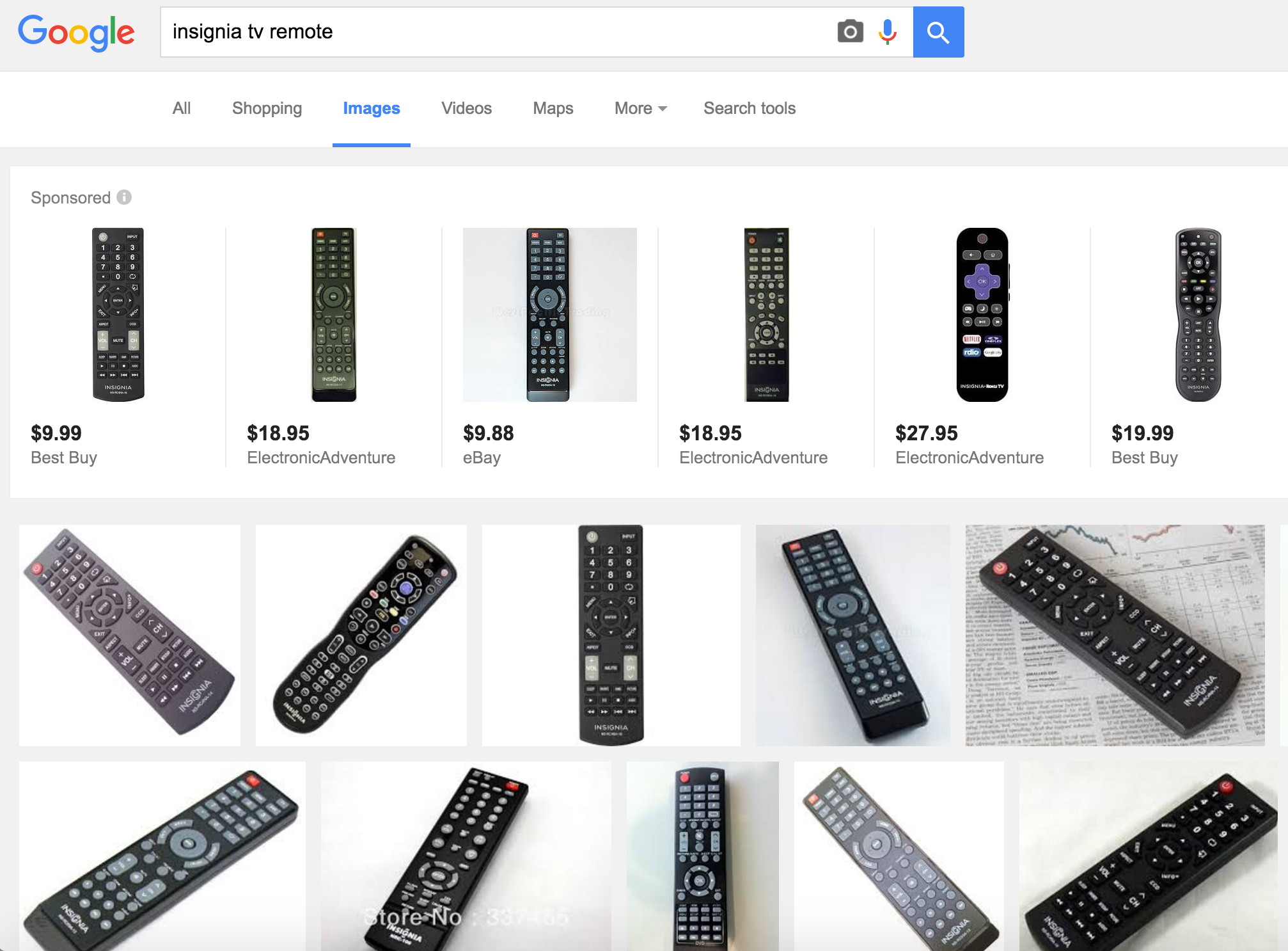
I think a lot of TV remotes have too many buttons. Like these:
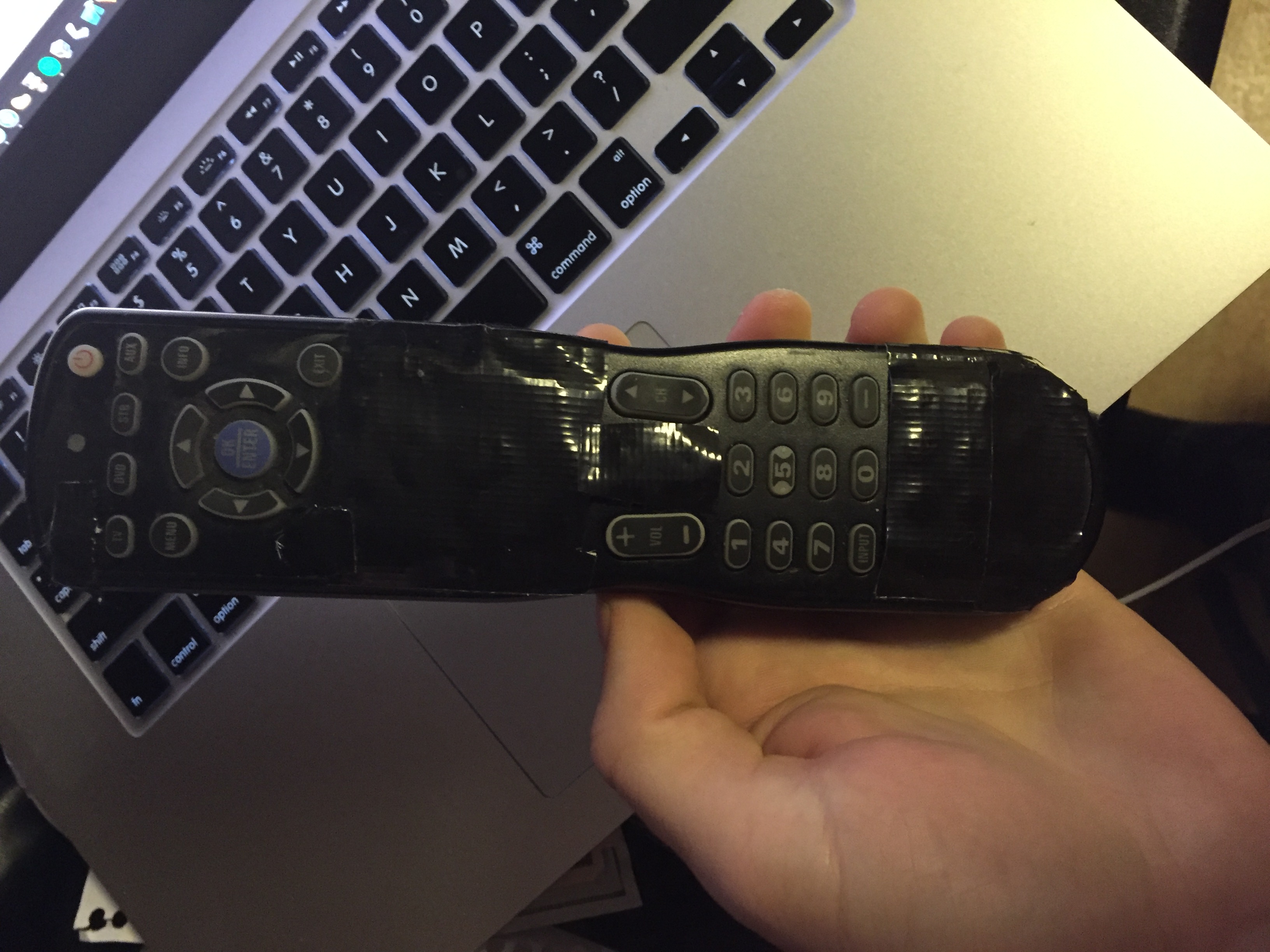
I bought an Insignia TV for $50 from a woman who was moving out of her apartment, and it came with a remote like that. I taped over all the buttons that I couldn’t understand:
I still think it’s possible I didn’t tape over enough of the buttons. It’s because I couldn’t cut the duct tape into small enough pieces. There are still 29 buttons remaining.
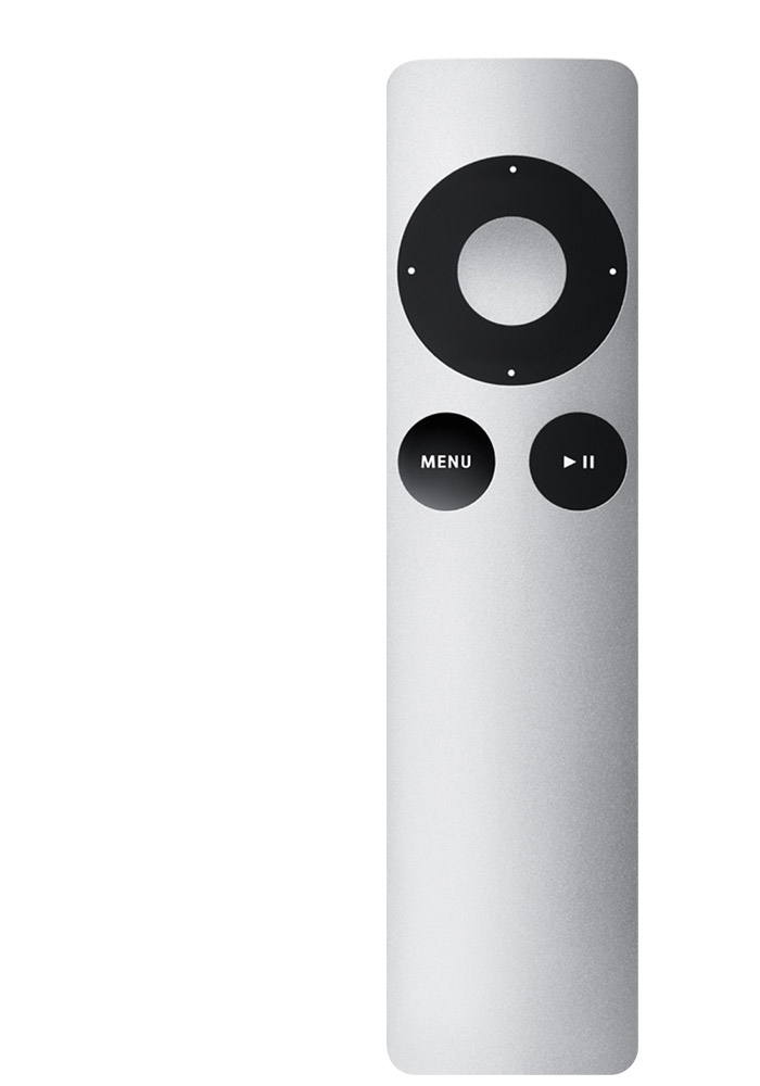
Here is an example of a remote that I think has a better number of buttons:
There are 7 buttons, and they are beautiful.
The only complaint I have is that it gets lost in the seat cushions. That’s a price I’m willing to pay.
What do you actually NEED in a remote?
Here’s a non-exhaustive list of some things that might make a “good” remote:
- Ergonomic (for example, fits in hand, and gives the ability to press buttons in the dark)
- Intuitive (it should be obvious what a button does)
- Simple (with less buttons, you need less instructions)
All of these give you a “functional” remote. What is the function of a TV remote? To control a TV from a distance.
My shitty Insignia remote
I think my Insignia remote does a good job at controlling my TV from a distance in a poorly designed way.
I don’t think it’s ergonomic. It is large and generally requires two hands to operate (unless you have a large hand). I can’t effectively press the buttons in the dark. Some remotes handle this by making the buttons glow different colors in the dark (which may be a reasonable solution). The problem with feeling for the buttons though is that they’re all mostly the same shape and size.
I don’t think it’s very intuitive or simple either. The only buttons that are intuitive to me are the power button, volume and channel controls, the number buttons, and the little control wheel at the top. I have to search for the menu button, too. Most of the other buttons are just noise.
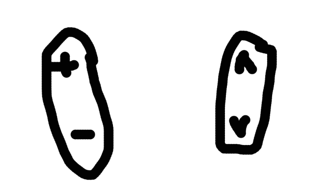
The volume and channel buttons are actually interesting in their design (this is actually a decent design element, I think):
As you can see in my scientifically accurate drawing above, as opposed to being distinguished by shape, the volume and channel buttons are distinguished by position, which can be learned. Even though they are the same size and shape, the user knows that the volume buttons are on the left side, and the channel ones are on the right.
The Apple TV remote
I think the Apple TV remote does a better job at this.
The top middle button is indented and surrounded by an embossed ring that is clearly a directional wheel. I’ve seen small children use this thing.
They are tactile, or designed to be perceived by touch. You know that if a button goes inwards, it does something different than the button next to it that goes outwards.
In fact, most of the buttons are distinguished by a combination of tactility, shape/size, and position. This combination helps the user learn how to reliably find the button without looking at it. This is important! This makes is simple and ergonomic, and the small number of buttons makes it simple. I could probably use this remote blindfolded (as opposed to the Rubix-cube-like Insignia remote).
And another thing: this remote can be used with one hand! You’ll notice the remote is appropriately hand-sized, and all the buttons are located in the top portion of the remote where your thumb reaches naturally.
Wait, it’s missing a power button! This is because you can literally press any button and the Apple TV will wake up. This is an interesting way of leveraging people’s natural tendency just to press literally every button when they are trying to figure out some buttoned device. I could hand a 6-year-old this remote, tell him to turn on the Apple TV, and if he pressed any button, he would succeed. This is amazing.
Apple to oranges
To be fair, my Insignia television and an Apple TV work in different ways, and require different inputs.
For example, my Insignia television uses the traditional channel system, which is some sequential combination of numbers. This may require a different input (such as the up/down channel lever and set of 0-9 digits). Ok, fair enough. The Apple TV handles input differently: you use the little selector wheel thing to move up, down, left, and right, to select applications to use. Also, to simplify the design of the remote, they decided to go with an on-screen keyboard when the user requires some sort of text input (the trade-off of simplifying the remote versus the pain in the ass of using an on-screen keyboard may have been a good one, since text input is a rarer case).
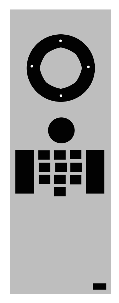
So what if I made my Insignia remote a little bit more like the Apple TV remote, but also considered that they both require some different sets of inputs? I might get something like this:
I omitted labels so that we could use it as a test for intuitiveness. While the above isn’t perfect, I think it uses some of the principles of the combination of tactility, size, and position to help the user determine what the function might be.
I think the wheel at the top is obvious. Some sort of direction selectors (perhaps for a menu?) a middle button (to select some sort of option?).
The little black circle below the wheel isn’t as obvious, but it’s sort of separate, so maybe it does something special, like open “menu”.
Underneath that, we have some sort of array of small buttons that looks like a calculator (perhaps they are number buttons? and is the bottom one “0” since it’s alone?). The two long rectangles on either side clearly have some similar purpose to the number button grid in the middle. Probably channel and volume changers.
All of these main buttons are grouped at the top of the remote. And then we see some weird little small orphan button all the way at the bottom of the remote where the user has to intentionally reach down and change hand position in order to press. This is on purpose. That’s because you use the button rarely. Perhaps it’s the input button that changes your TV input from HDMI-1 to HDMI-2, or something like that. It’s special because it has a different shape/size and position than every other button on the remote.
Conclusion
I felt obligated to have a conclusion paragraph even though I didn’t have anything more to say. So, to sum up: most remotes do their job of controlling TVs from a distance, but do it in a poorly designed way. This makes the process frustrating. This can be fixed by using some combination of tactility, shape/size, and position to distinguish a simple set of buttons from each other. The Apple TV does this more or less well compared to my current remote. However, we need to also consider the “input” factor, meaning that the remotes are designed differently because the receiver (the television or the Apple TV) requires some different sets of user inputs for the most part.
Thanks for reading!
Image from Apple Support ↩︎
